Gentype.io

Product Design

No-code Development

Branding

Gentype.io

Product Design

No-code Development

Branding

Gentype.io

Product Design

No-code Development

Branding

Gentype.io

Product Design

No-code Development

Branding

Gentype.io

Product Design

No-code Development

Branding

From idea to launch in two weeks using no-code & AI

From idea to launch in two weeks using no-code & AI

From idea to launch in two weeks using no-code & AI

From idea to launch in two weeks using no-code & AI

A conversation reflecting on launching a digital asset store. Transforming typography with no-code and AI.

Screenshot of Gentype.io homepage showcasing bold typography with the headline ‘Themed letters to step up your branding game,’ neon green call-to-action buttons, and a minimalist layout.

Gentype

interview

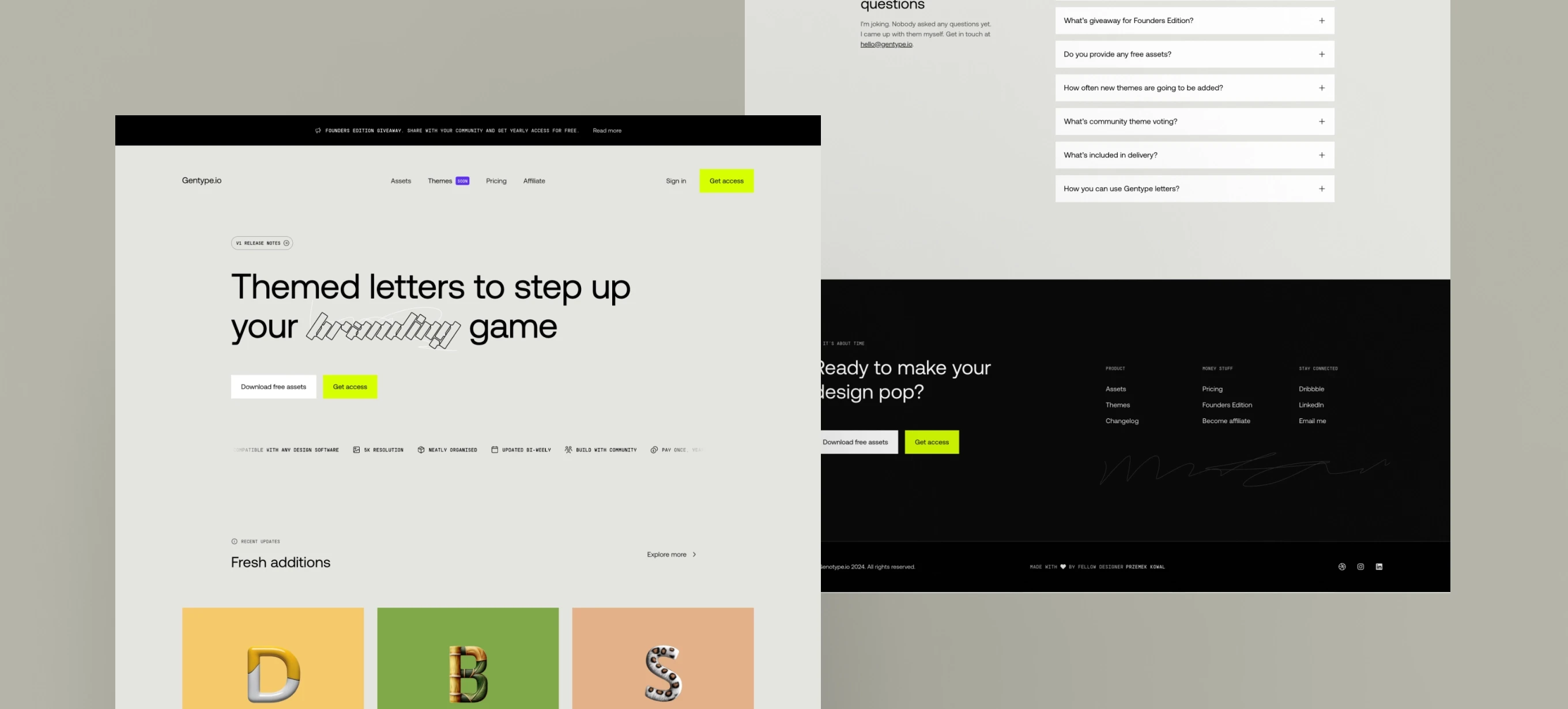
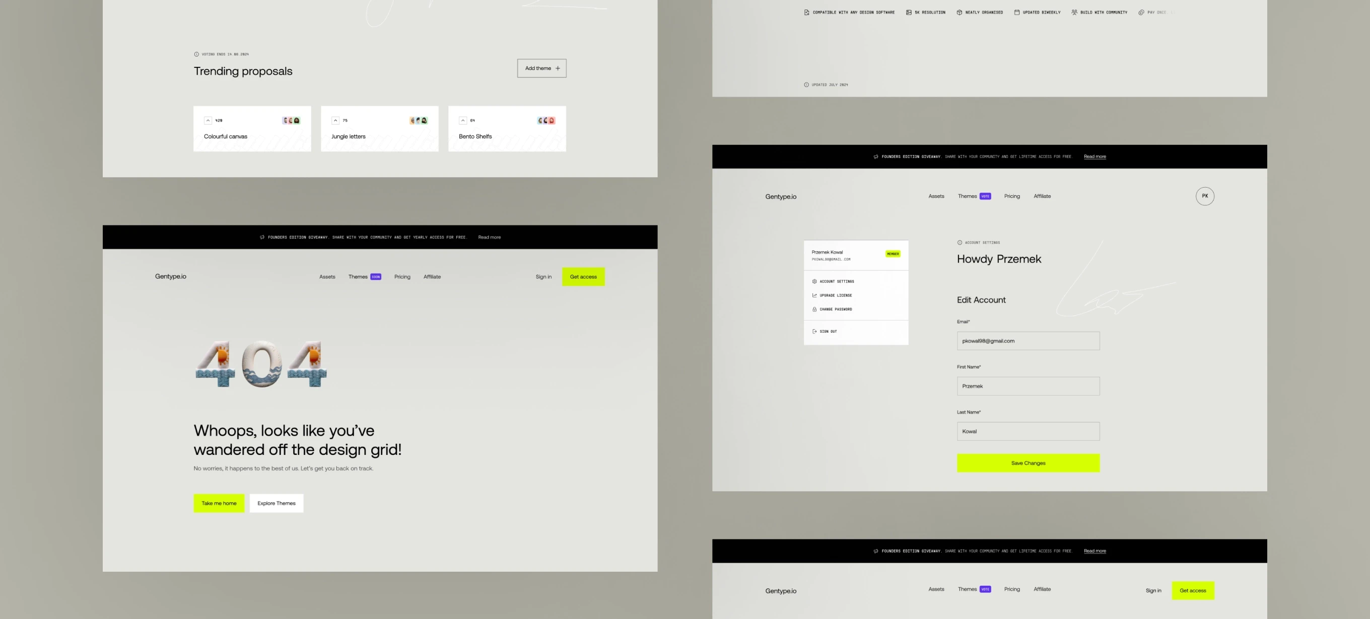
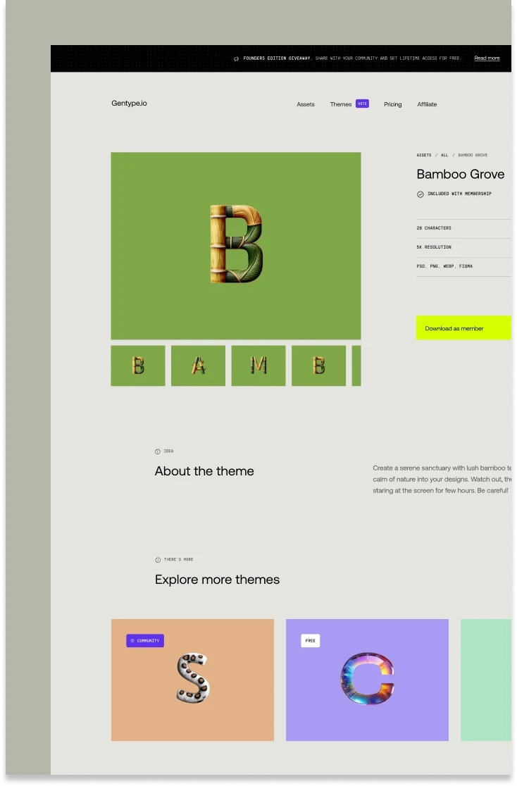
Why building your own asset store?

I’d always dreamed of launching my own product, so Gentype was a huge moment for me. You know that disappointed feeling you get when you download something from a stock site and it’s not quite up to scratch? I really wanted to create a digital asset store where every delivery hits the spot.

Timeline

2024

Team size

1

My role

Everything

You can try it for free: grab Cozy Sleep, where plump, cushion-like letters feature intricate side stitching, or Metallic Balloons, where each letter is designed with a soft, creased texture that adds real depth and a touch of industrial style. I went down the no-code route, which was an exciting new challenge for me I trained myself up on Framer and used FramerAuth for sign-in and license purchasing functionality. It didn’t mean that I wasn’t getting my hands dirty with the code, though. Both the interactive voting element, which lets community members vote and share their own theme ideas, and the generation of pre-signed AWS links rely on custom code that pushes no-code to its absolute limits.
Despite what Adobe’s license checking system might have thought, as a 12-year-old kid, I didn’t have many options. Try convincing your mom to spend a monthly wage on a license key delivered via email! I couldn’t explain what email was, so I took matters into my own hands. Don’t blame me I tried! I bought a genuinely legitimate box edition of Photoshop at a flea market for a whopping £2, only to discover that Photoshop existed before ‘CS’ and the version I got ran on Windows 98… My Pentium PC was already running Millennium.
You can try it for free: grab Cozy Sleep, where plump, cushion-like letters feature intricate side stitching, or Metallic Balloons, where each letter is designed with a soft, creased texture that adds real depth and a touch of industrial style. I went down the no-code route, which was an exciting new challenge for me I trained myself up on Framer and used FramerAuth for sign-in and license purchasing functionality. It didn’t mean that I wasn’t getting my hands dirty with the code, though. Both the interactive voting element, which lets community members vote and share their own theme ideas, and the generation of pre-signed AWS links rely on custom code that pushes no-code to its absolute limits.

You can try it for free: grab Cozy Sleep, where plump, cushion-like letters feature intricate side stitching, or Metallic Balloons, where each letter is designed with a soft, creased texture that adds real depth and a touch of industrial style. I went down the no-code route, which was an exciting new challenge for me – I trained myself up on Framer and used FramerAuth for sign-in and license purchasing functionality. It didn’t mean that I wasn’t getting my hands dirty with the code, though. Both the interactive voting element, which lets community members vote and share their own theme ideas, and the generation of pre-signed AWS links rely on custom code that pushes no-code to its absolute limits.

You can try it for free: grab Cozy Sleep, where plump, cushion-like letters feature intricate side stitching, or Metallic Balloons, where each letter is designed with a soft, creased texture that adds real depth and a touch of industrial style. I went down the no-code route, which was an exciting new challenge for me I trained myself up on Framer and used FramerAuth for sign-in and license purchasing functionality. It didn’t mean that I wasn’t getting my hands dirty with the code, though. Both the interactive voting element, which lets community members vote and share their own theme ideas, and the generation of pre-signed AWS links rely on custom code that pushes no-code to its absolute limits.

Very cool. Aside from stock site fails, where did the idea for Gentype come from?

The idea of generating themed letters, later extended into entire alphabets, goes back to the simracing league business I set up with my brother. For the second season, named “Worldwide Challenge,” drivers embarked on a globe-trotting tour, racing on the most iconic tracks on each continent. This idea was then reflected in our branding, with each track receiving its own themed letter inspired by something unique about the location. For example, the Spa-Francorchamps track in Belgium which I had the chance to visit with my brother and best friend is surrounded by a stunning forest, so the letters I created draw inspiration from trees and leaves. I found myself with a little free time, so obviously I started thinking about ideas for side projects. I thought maybe I could expand the design of standalone letters into entire alphabets. I was really excited by the design possibilities but also really interested in the technical and business challenges.

The idea of generating themed letters, later extended into entire alphabets, goes back to the simracing league business I set up with my brother. For the second season, named “Worldwide Challenge,” drivers embarked on a globe-trotting tour, racing on the most iconic tracks on each continent. This idea was then reflected in our branding, with each track receiving its own themed letter inspired by something unique about the location. For example, the Spa-Francorchamps track in Belgium – which I had the chance to visit with my brother and best friend – is surrounded by a stunning forest, so the letters I created draw inspiration from trees and leaves. I found myself with a little free time, so obviously I started thinking about ideas for side projects. I thought maybe I could expand the design of standalone letters into entire alphabets. I was really excited by the design possibilities – but also really interested in the technical and business challenges.

The idea of generating themed letters, later extended into entire alphabets, goes back to the simracing league business I set up with my brother. For the second season, named “Worldwide Challenge,” drivers embarked on a globe-trotting tour, racing on the most iconic tracks on each continent. This idea was then reflected in our branding, with each track receiving its own themed letter inspired by something unique about the location. For example, the Spa-Francorchamps track in Belgium which I had the chance to visit with my brother and best friend is surrounded by a stunning forest, so the letters I created draw inspiration from trees and leaves. I found myself with a little free time, so obviously I started thinking about ideas for side projects. I thought maybe I could expand the design of standalone letters into entire alphabets. I was really excited by the design possibilities but also really interested in the technical and business challenges.
3D letter ‘S’ made of intertwined wood and green leaves on a mint green background with bold white text reading ‘FRANCOR CHAMPS.’
Schedule of racing events with bold typography, world map backgrounds, and artistic letter designs. Highlighted event for ‘Kyalami’ on a yellow background with bamboo-themed letter ‘K.

What were the most satisfying moments you had working on this product?

It was an enormous task,
though, right?

The launch week was a blast, Gentype got such an amazing reception on LinkedIn. My launch message got nearly 7,000 impressions and was my most popular post of all time (so far!). There were some amazingly encouraging messages from design colleagues old and new. It was genuinely moving.

You're hands down one of the best designer I know and I think you will kill it building your own thing.

You're hands down one of the best designer I know and I think you will kill it building your own thing.
Gentype.io user menu showing account options for Przemek Kowal with a minimalist layout and neon green accents.
3D letter ‘A’ with realistic zebra fur texture on a gray background.

So you went down the no-code route – what challenges did you have to tackle?

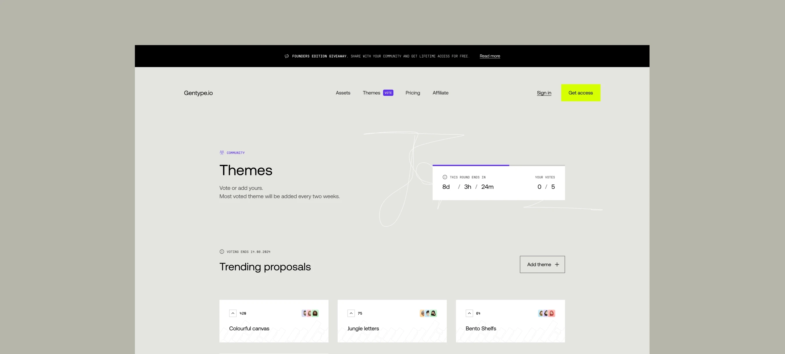
Well I didn’t have any problems building the website’s front end and the no-code aspects of it, but then I had to find a way to allow users to sign up, sign in and buy the licence. I also wanted the website to have a voting system. To make that happen, I experimented a lot with the technology and went beyond what I would typically do as a designer or even as a no-code developer.

One tool I found particularly helpful was a Framer plugin called FramerAuth. I actually got to know the person who came up with that plugin – so as well as building a website, I was building connections too.

Gentype has transformed the way I approach type design. The font library is dynamic and offers many options, making it easy to experiment with unique styles while maintaining full creative control. Whether you’re a designer looking for inspiration or a developer in need of custom typography, Gentype is a game-changer. Highly recommended!

Gentype has transformed the way I approach type design. The font library is dynamic and offers many options, making it easy to experiment with unique styles while maintaining full creative control. Whether you’re a designer looking for inspiration or a developer in need of custom typography, Gentype is a game-changer. Highly recommended!

You used AI too, didn’t you?

Yep. I had to find a way to allow people to download assets, but I didn't want to publicly post Google Drive links that would mean they could be shared very easily. So I built a technology using ChatGPT that pre-signs the links. What that means is you get a download link that's valid for 60 seconds, but you can't really share it with someone else not signed to the system.

Yep. I had to find a way to allow people to download assets, but I didn't want to publicly post Google Drive links – that would mean they could be shared very easily. So I built a technology using ChatGPT that pre-signs the links. What that means is you get a download link that's valid for 60 seconds, but you can't really share it with someone else not signed to the system.

Gentype.io interface showing trending themes, a playful 404 error page with neon accents, and an account settings page for Przemek Kowal.

And the website took just a couple of weeks to build?

That’s right. Actually, it would have been quicker, but I ended up needing some technical back-up to get the voting system up and running. 

What other challenges did you have to overcome?

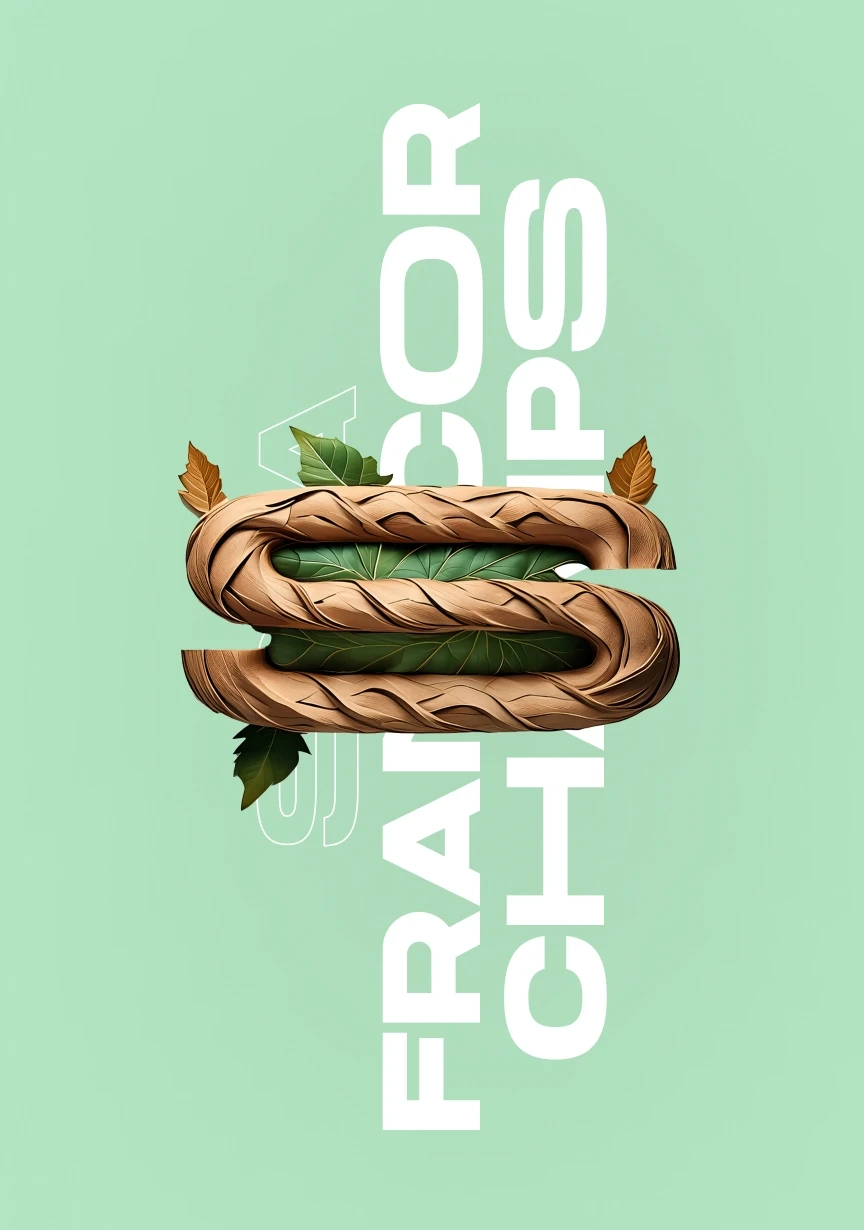
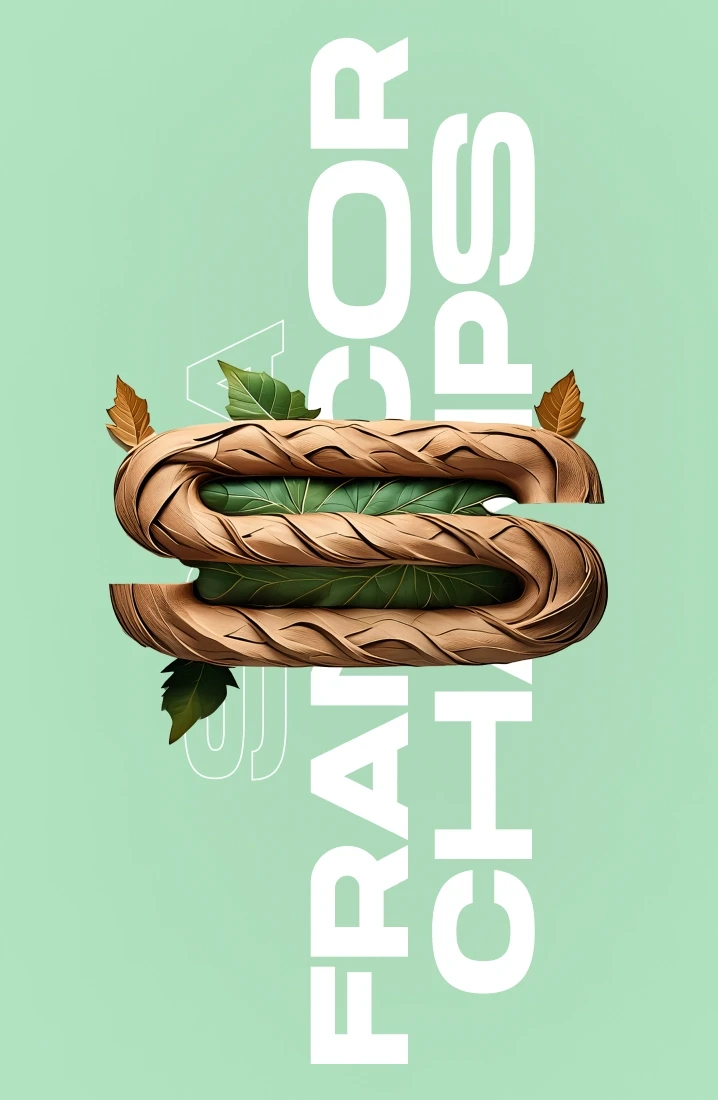
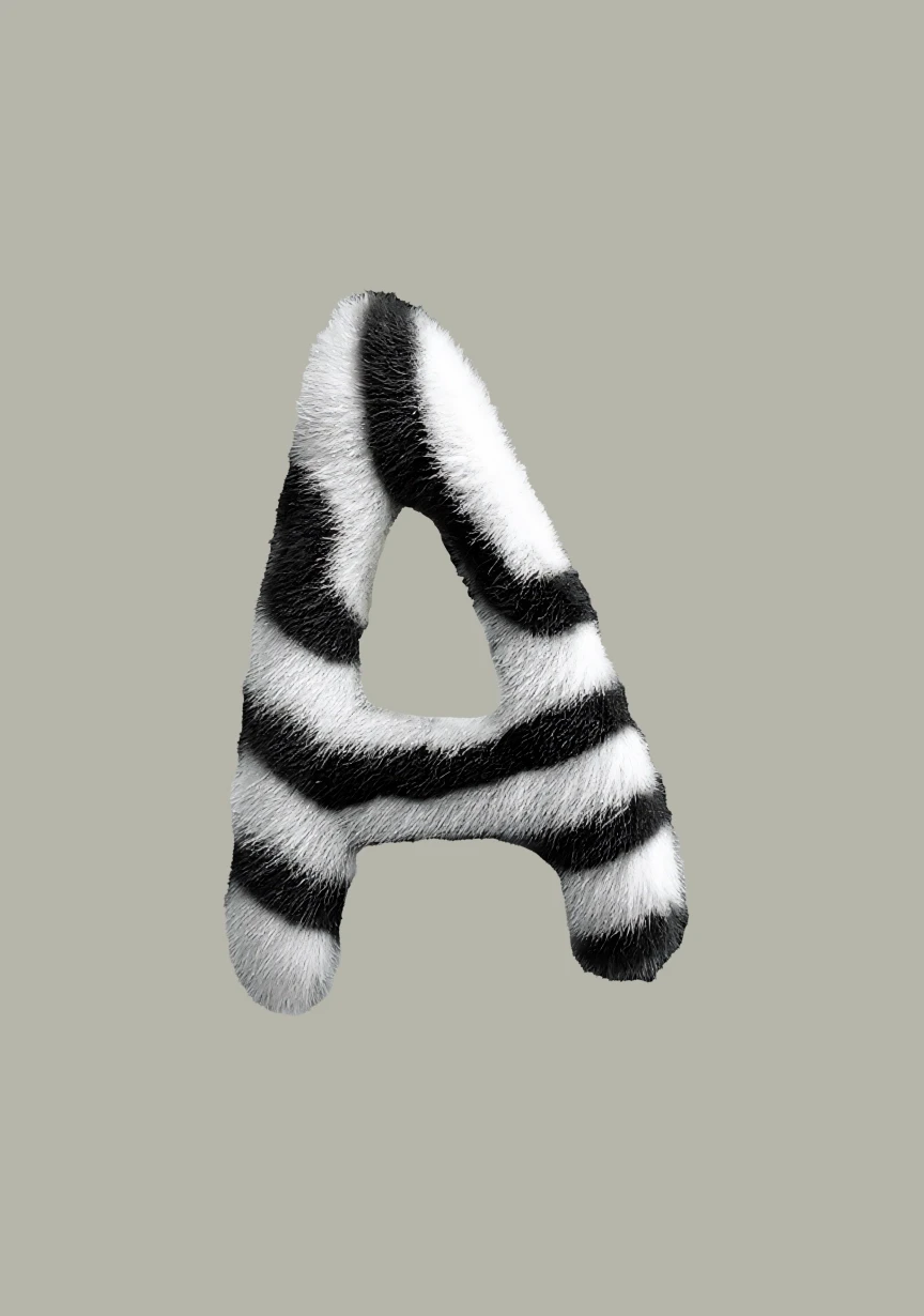
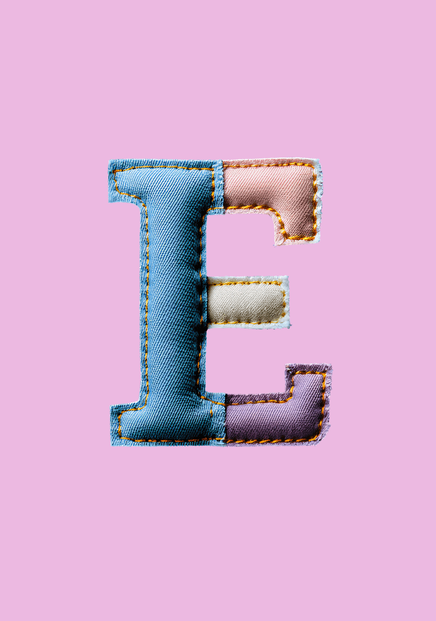
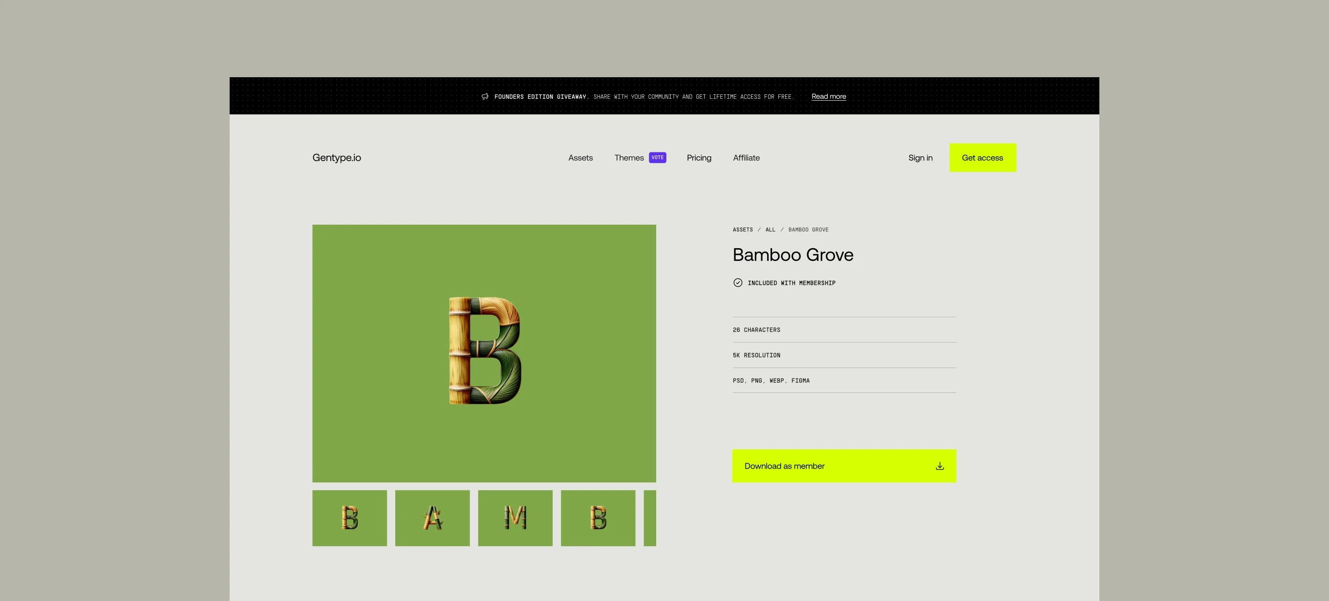
Well, generating the letters was time consuming and getting the style from AI was challenging at times because it would sometimes produce the wrong letters. So I really had to perfect the technology behind it to get the letters out there.

What would you say makes a good font?

That's a hard one! Definitely the technical aspects of it. Good designers can quickly judge a font from a technical point of view - things like whether it has proper kerning pairings, alternative sets and whatnot. It’s not only about how the letters look, but how they appear on your screen.

That's a hard one! Definitely the technical aspects of it. Good designers can quickly judge a font from a technical point of view - things like whether it has proper kerning pairings, alternative sets and whatnot. It’s not only about how the letters look, but how they appear on your screen.

Here’s a bit of a silly question for you… what’s the best font?

What’s the best font? There's no one font that fits all. The best font is the one that conveys the emotions your product needs to present. That’s why branding relies on fonts so heavily. The font you pick can really give your project a boost that’s something that’s often overlooked.

What’s the best font? There's no one font that fits all. The best font is the one that conveys the emotions your product needs to present. That’s why branding relies on fonts so heavily. > The font you pick can really give your project a boost – that’s something that’s often overlooked.

Gentype.io product page showcasing the ‘Bamboo Grove’ letter set with a bamboo-inspired 3D letter ‘B’ on a green background and neon download button.

When did you first get interested in typography?

It was probably around the time I was getting into the design. I actually started my design career in branding, where typography is seen as this massively important thing. That gave me a different perspective compared to some other designers. I realised very early on that typography is a crucial part of web design. If you look at a website and delete all the text, you’re left with almost nothing.

It was probably around the time I was getting into the design. I actually started my design career in branding, where typography is seen as this massively important thing. That gave me a different perspective compared to some other designers. I realised very early on that typography is a crucial part of web design. If you look at a website and delete all the text, you’re left with almost nothing.

So do you think it's an underappreciated area for product designers?

Absolutely. If you don't have a background in different kinds of design, like branding or print, you’re less likely to understand how crucial typography can be. I learned a lot about typography right from the start and it’s been invaluable in my work as a digital product designer.

Absolutely. If you don't have a background in different kinds of design, like branding or print, you’re less likely to understand how crucial typography can be. I learned a lot about typography right from the start and it’s been invaluable in my work as a digital product designer.

Read next

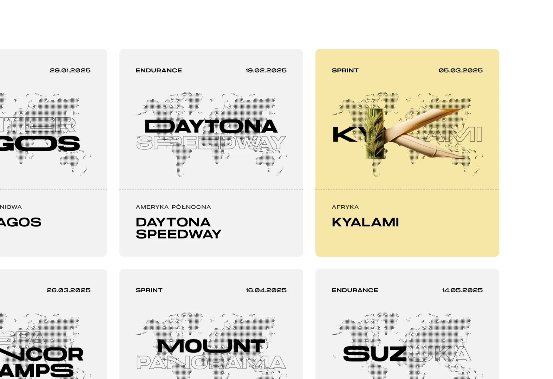
Brothers in crime—bridging simracing and business.

B2-SIM

Product Design

No-code Development

Branding

B2-SIM

Product Design

No-code Development

Branding

B2-SIM

Product Design

No-code Development

Branding

B2-SIM

Product Design

No-code Development

Branding

Projects

Every project is a unique story.

Every project is
a unique story.